WHOLE HUMAN NUTRITION
HOLISTIC APPROACH TO DIGESTIVE HEALTH.
Visual Identity.

Amid a growing demand for evidence-based wellness, Whole Human Nutrition bridges the gap between science and self-awareness. Created for nutritionist Marian Carzo, the brand redefines health as a dynamic balance between data and daily life — where measurable progress meets emotional well-being.
Rooted in a holistic yet scientific approach, Whole Human Nutrition recognizes that our habits, stress, and mindset are just as vital to digestive health as nutrition itself. The project’s goal was to translate this philosophy into a clear, grounded identity that feels both professional and deeply human.
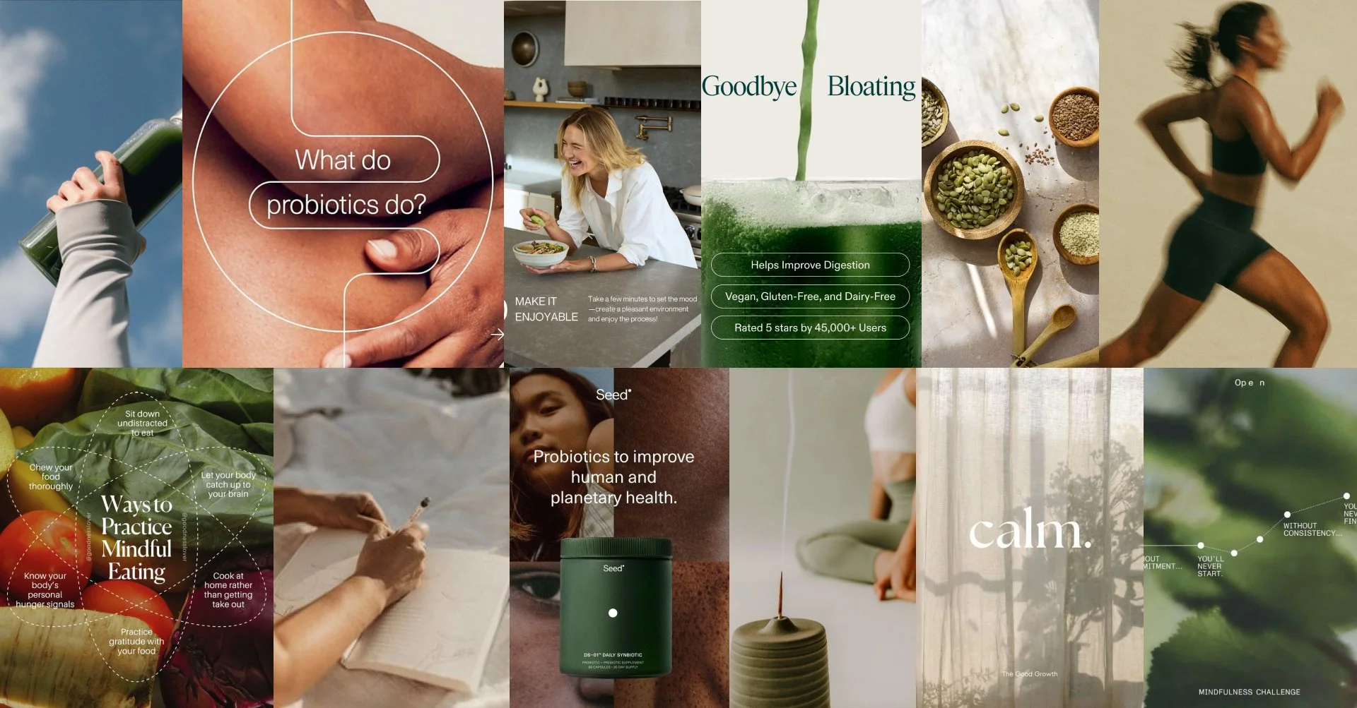
Research and Insights
Through user interviews, market research, and competitive analysis, we identified a clear opportunity: users who despite maintaining disciplined lifestyles, struggle with persistent digestive discomforts that affect both their energy and performance.
Common profiles centered around high-performance routines, health consciousness, and the pursuit of balance.
We developed a User Profile, Buyer Persona, and Brand Persona to deeply understand values, interests, and lifestyles of the target audience and of the brand itself.
These insights informed a brand and design strategy focused on trust, emotional connection, and visual distinction.

Conceptual Foundation
The brand concept is rooted in the fusion of wellness and digestive health, inspired by the natural rhythm and flow of the digestive system.
The name “Whole Human” reflects the core philosophy of nutritionist Marian Carzo — viewing health not as the absence of pain, but as a state of wholeness and harmony between body, mind, and habits.
Visually, the identity expresses this sense of movement and balance through its color palette and organic graphic elements, symbolizing vitality, connection, and the continuous process of inner well-being.

Visual IDENTITY
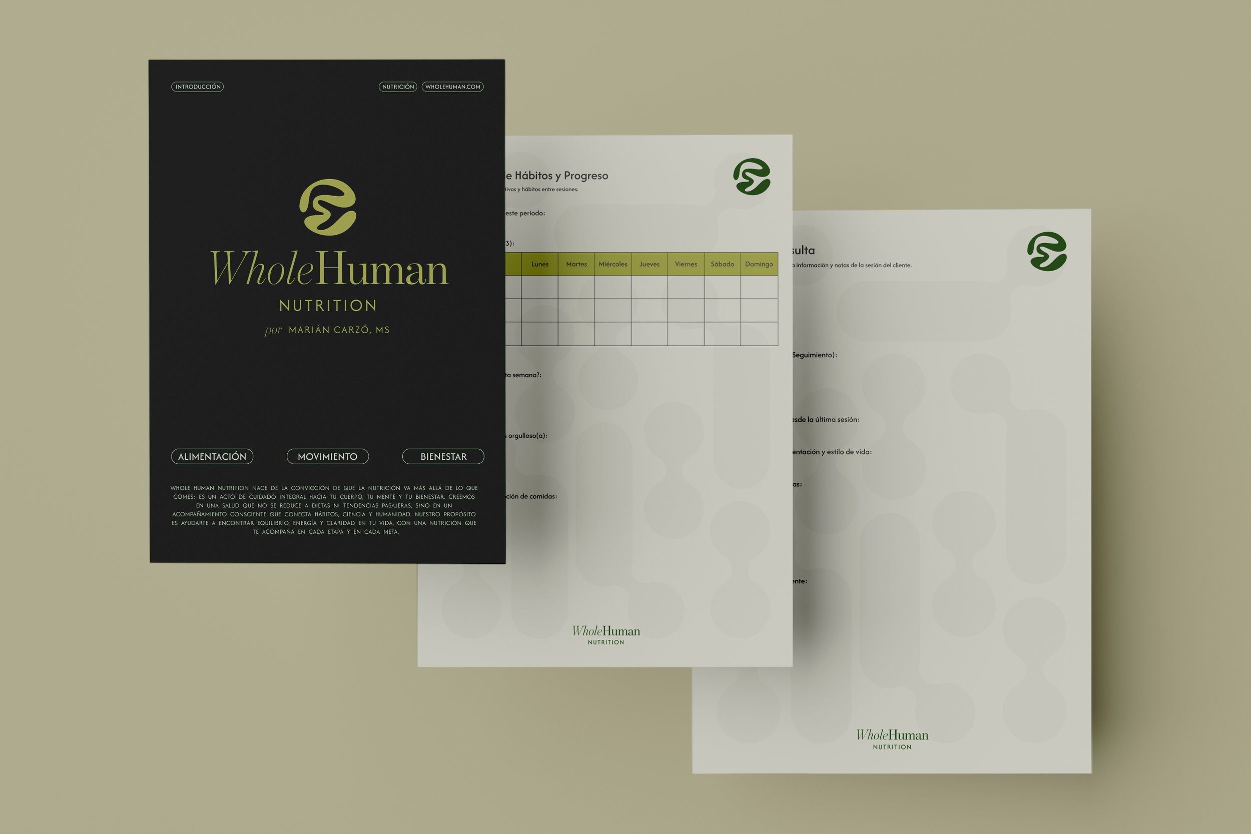
Logotype
The logotype was carefully crafted to balance professionalism with a fresh, forward-thinking approach to health. The fusion of type weights and styles highlights the contrast between the two words, emphasizing the duality within the brand — science and humanity, structure and flow.
Isotype
The isotype is an abstract interpretation of the digestive system — tracing the natural flow from the esophagus through the stomach and intestines. Its circular shape represents balance and harmony, reflecting the brand’s core philosophy of viewing health as an interconnected whole. Designed with an open form from right to left, it symbolizes movement, flow, and the beginning of a personal journey toward digestive wellbeing.
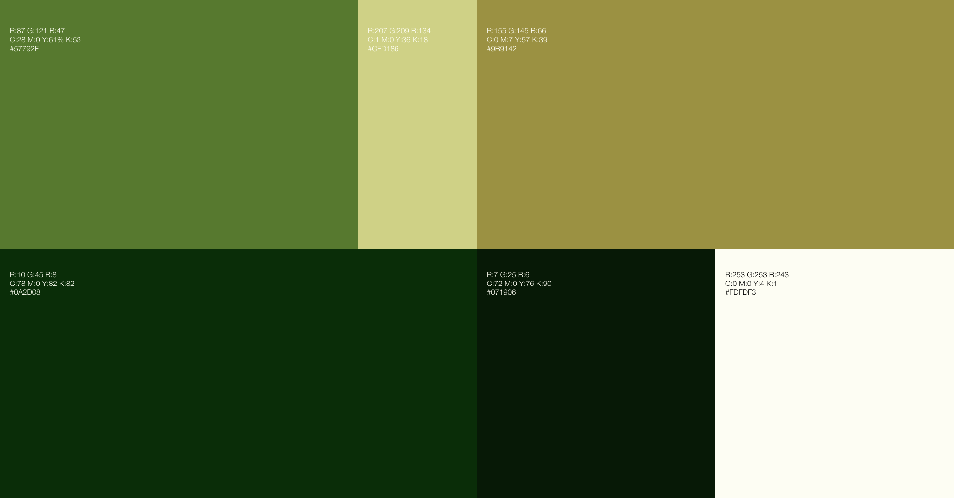
Color Palette
The color palette was strategically designed to reflect the brand’s core values — trust, compassion, and science with humanity:
Deep green conveys balance, confidence, and holistic wellbeing.
Olive green adds warmth and natural harmony.
White evokes clarity, calm, and transparency.
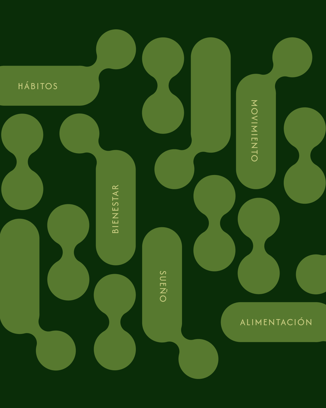
Graphic Elements
The graphic system was developed from the brand’s core symbol — the circle. Inspired by organic forms, these elements echo the fluidity of the human body while maintaining visual harmony with the brand’s thin, stylized typography.
Sequential organic shapes represent internal cellular connections, creating an adaptable visual pattern that enhances both digital and physical applications, ensuring a cohesive and elevated brand presence across all touchpoints.