AFTER LYFE
STAY AUTHENTIC.
Visual Identity.

After Lyfe was born at the intersection of fashion and urban culture — a space where music, authenticity, and self-expression turn into style. Designed for those who live between beats, graffiti, and city lights, the brand celebrates a new generation unafraid to show who they truly are.
Inspired by the pulse of hip hop, rap, and reggaeton, After Lyfe redefines street style through a conscious and sophisticated lens. Every piece is a statement — a reminder that what you wear is also how you speak, belong, and challenge.
Research and Insights
Through trend analysis, cultural observation, and social media exploration, we identified a clear opportunity within the urban fashion landscape:
Common profiles centered around music, creativity, and self-expression, with a strong connection to hip hop, rap, and reggaeton culture.
We developed detailed User Profiles, Buyer Personas, and a Brand Persona to deeply understand the values, motivations, and lifestyles of this community.
These insights informed a design strategy that emphasizes authenticity, confidence, and individuality — fostering real connection through aesthetics, storytelling, and a shared sense of cultural pride.

Conceptual Foundation
The brand concept is rooted in the fusion of music and self-expression, drawing inspiration from the bold individuality of artist Lil Uzi Vert.
The name After Lyfe reflects a state of transformation — a space beyond convention, where identity is fluid and style becomes a form of rebellion and rebirth.
Visually, the brand captures the tension between punk attitude and urban sophistication. Spiked, asymmetrical forms and electric accents reference Lil Uzi Vert’s iconic hairstyle and fearless aesthetic, while clean compositions and balanced layouts ground the visual system in confidence and clarity.
The resulting identity embodies freedom, duality, and defiance — a visual statement that celebrates authenticity and challenges the boundaries of streetwear culture.


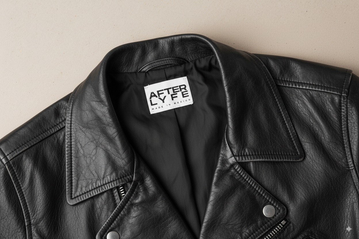
Visual IDENTITY
Logotype
The logotype embodies the boldness and confidence of the brand through a heavy, assertive typeface that reflects its rebellious spirit. The isotype is seamlessly integrated within the wordmark, reinforcing unity and recognition while enhancing the visual strength of the brand.
Isotype
The isotype takes direct inspiration from Lil Uzi Vert’s distinctive mohawk, a symbol of individuality and creative rebellion. Building on this reference, a star-shaped spark was incorporated — a meaningful element for the client that represents energy, transformation, and personal expression. By merging these two ideas, the result is a unique symbol that captures the essence of After Lyfe: bold, unconventional, and unapologetically authentic.
Color Palette
The palette blends red and neutral tones to express confidence and authenticity.
Accent colors:
Red symbolizes the energy, passion, and self-expression.
Neutrals bring balance, clarity, and sophistication.
Graphic Elements
The design combines a circle and a square to represent the connection between wellness and technology. The circle symbolizes growth, balance, and human interconnectedness, while the square stands for stability, order, and digital precision. Their fusion creates a spark, visually embodying the brand’s philosophy of purposeful creation.
Photography Style
Captures a raw yet intentional aesthetic — spontaneous, emotional, and unfiltered. Shot primarily in black and white with high contrast, movement, and flash, the imagery evokes the energy of nightlife and street culture. Each frame feels alive and rebellious, celebrating imperfection and authenticity while conveying the brand’s confident, urban attitude.