


MOVEXA TRANSPORTES
punctuality in every delivery.
Visual Identity & Web Design (Squarespace).

The brand embodies the strength and commitment of those who keep production lines moving and promises fulfilled. More than a logistics company, Movexa stands as a trusted partner—a team that understands the value behind every shipment and the importance of delivering without delay.
With a clear, confident, and transparent voice, Movexa represents efficiency, responsibility, and trust—qualities that turn transport into long-term collaboration. It’s not just about moving cargo; it’s about moving industries forward.
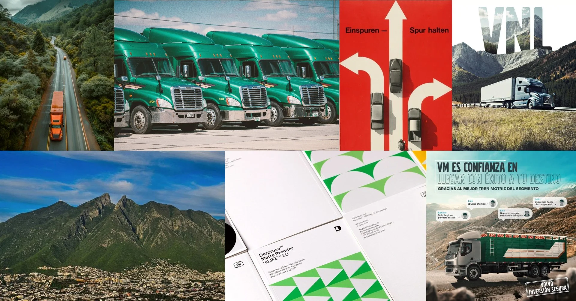
Research and Insights
Through market research, competitor analysis, and interviews with logistics managers, we identified a key opportunity: most transportation services focus on volume and coverage, but few communicate reliability and human connection.
Common profiles centered around industrial and manufacturing professionals whose success depends on punctuality, accuracy, and trust in their logistics partners.
We developed User and Brand Personas to deeply understand these motivations, revealing a shared desire for efficiency backed by accountability.
These insights shaped a brand strategy focused on clarity, commitment, and confidence—positioning Movexa as a logistics partner that delivers more than cargo: it delivers certainty.

Conceptual Foundation
The brand concept is based on the fusion of movement and trust, inspired by the precision and rhythm of industrial logistics in northern Mexico.
The name, derived from movement, reflects agility, progress, and purpose—core values that define the brand’s role as a reliable logistics partner.
Visually, the identity balances strength and clarity through a bold geometric typeface that conveys stability, and subtle arrow forms that suggest direction and momentum.
The result is a solid yet dynamic system that captures Movexa’s essence: a dependable ally keeping operations in motion and businesses moving forward.
Visual IDENTITY
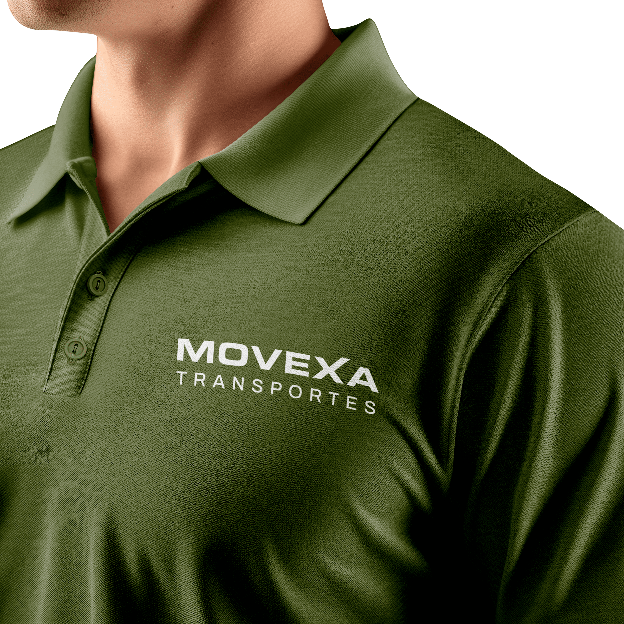
Logotype
The logotype features a bold, strong typeface that communicates reliability and confidence. The extended “X” ascends upward, symbolizing transcendence and continuous growth — one of Movexa’s core values. This subtle gesture adds motion and purpose to the wordmark, reinforcing the brand’s spirit of advancement and its commitment to moving forward with every delivery.
Isotype
The isotype originates from the “X” in the logotype, reimagined as a fusion between a letterform and an arrow. By adding an additional line to the X, the shape evolves into a dynamic symbol that represents direction, progress, and transcendence. This simple yet powerful form reinforces the brand’s purpose: to move forward with precision, confidence, and momentum.
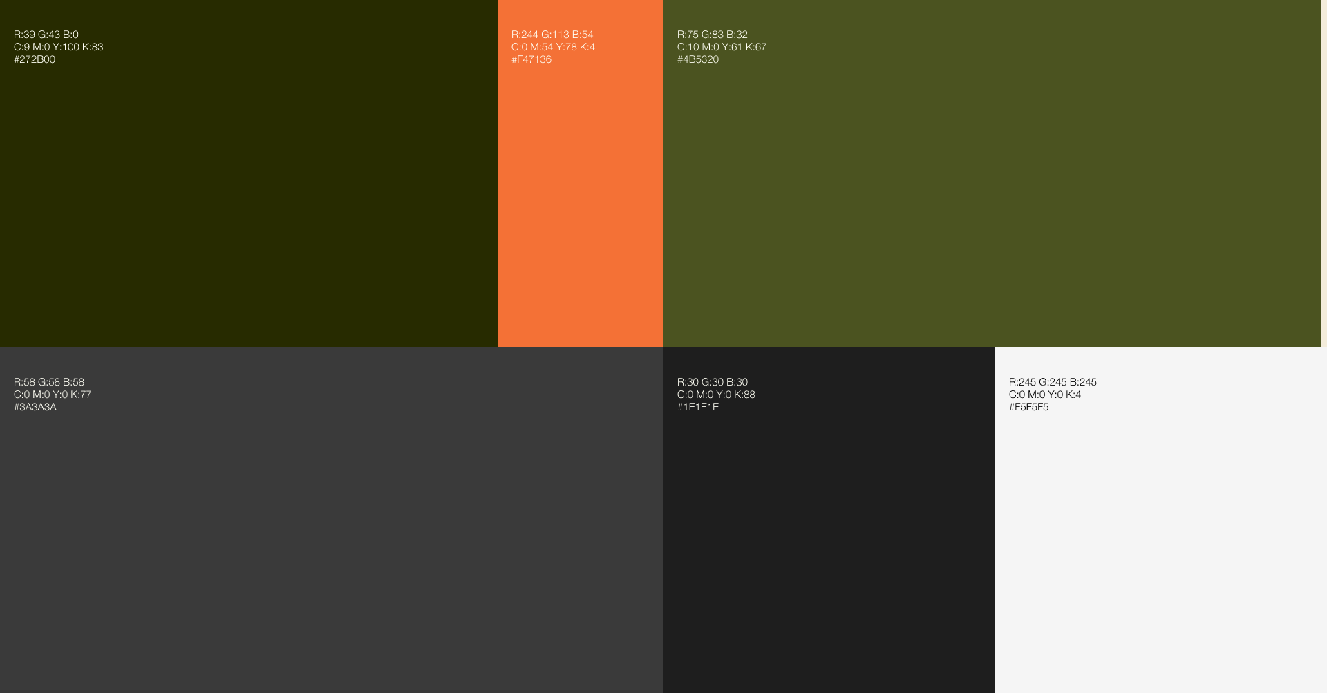
Color Palette
Grayscale from black to white communicates growth, balance, and connection.
Accent colors:
Green communicates strength, discipline, and structure.
Orange introduces a vibrant accent, breaking the neutrality with a touch of energy and attention.
Graysacle provide a solid foundation, reinforcing reliability and contrast while maintaining a premium feel.
Graphic Elements
Each element was designed from the ascending structure of the primary typeface, evoking arrows and movement to reinforce the brand’s core concepts of direction, efficiency, and progress — essential values in the logistics and transportation sector.
The pattern is built from a repetition of the isotype, intentionally creating visual continuity and brand recognition across various applications.


web design
oBJECTIVE
To design a professional and trustworthy website that reflects Movexa’s reliability and precision in the logistics and transportation sector. The goal was to build a digital presence that communicates movement, direction, and confidence — offering clients clear access to services, contact information, and the company’s operational strengths through a clean, intuitive, and responsive user experience.
Key web Implementations
Homepage
Built around a clear visual hierarchy that quickly communicates Movexa’s reliability and purpose. The use of movement-inspired graphics and bold typography creates instant brand recognition and trust.
Services Section
Concise layout with visual images allows users to scan and understand offerings effortlessly — reducing cognitive load and improving navigation flow.
Value Proposition & Why Movexa
Strategically placed trust elements and benefit-driven messaging establish credibility early, supporting conversion and engagement.
Reviews & Testimonials
Social proof reinforces brand reliability and fosters trust — key factors in service-based decision-making.
Contact Form
Minimal, well-structured form optimized for quick completion, lowering barriers to communication and improving lead generation.